3530 Landfair Rd, Pasadena, CA 91107 - 626-757-5079
3530 Landfair Rd, Pasadena, CA 91107 - 626-757-5079
Extract and display the most significant information from complex data sets. Analyze, research and compare complex data with ease.
Export data to various formats: PDF, PNG, Excel and CSV.
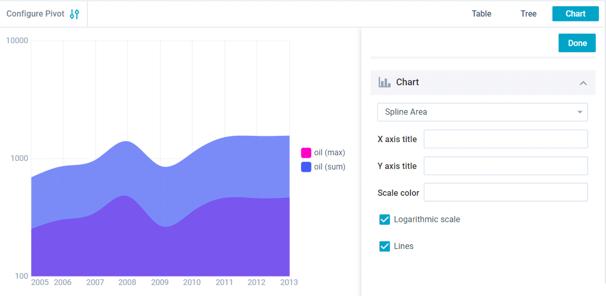
Customize datatable settings, tune the configuration window and adjust filters.
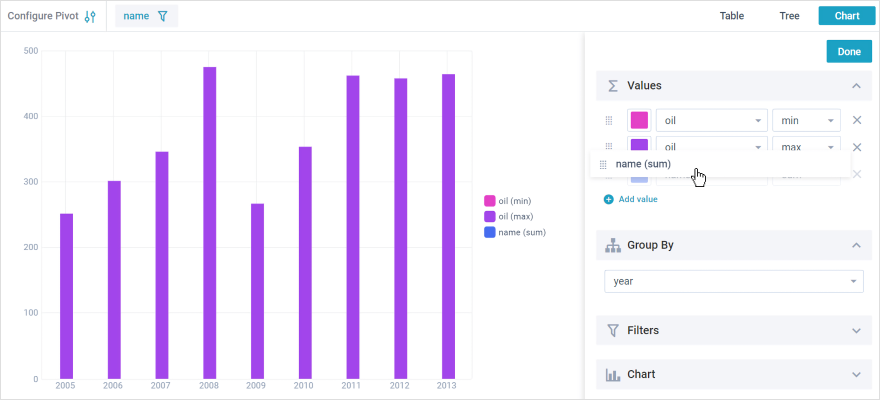
Create your own functions for data aggregation.
Adjust dates, numbers, monetary units and text labels associated with particular countries.
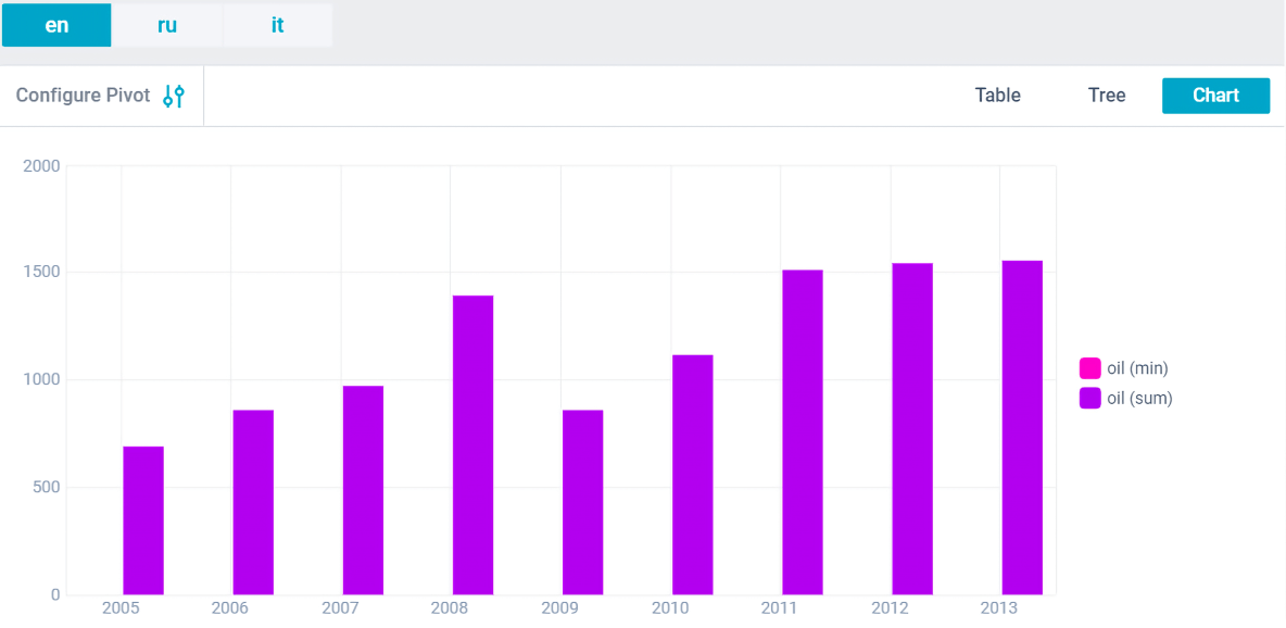
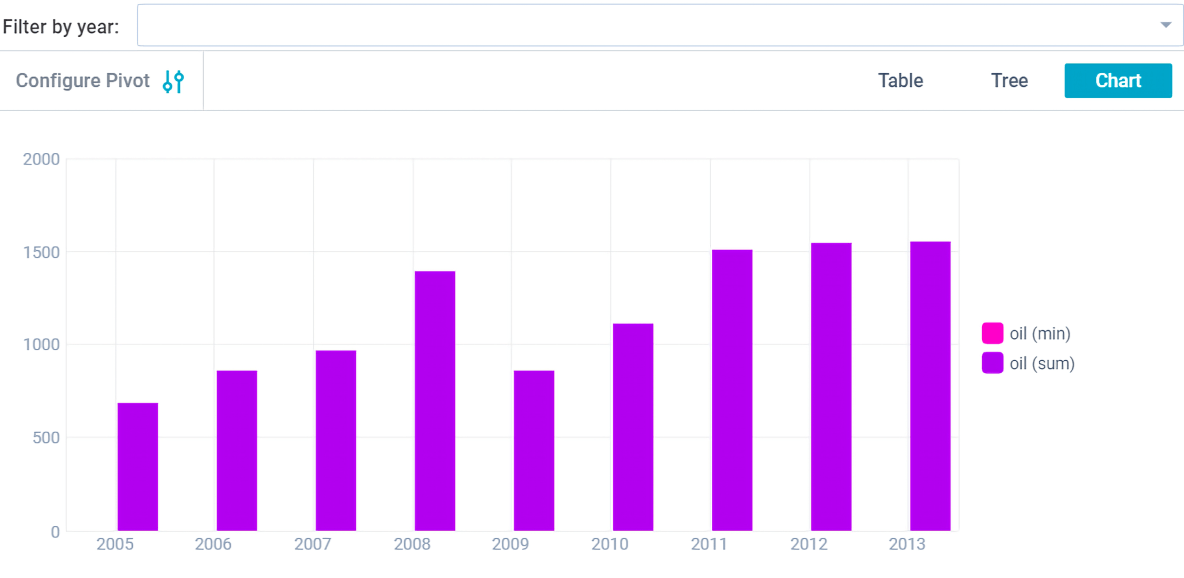
Viewing data in the form of Table, Tree, Chat.
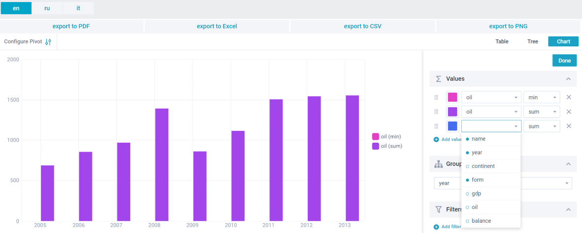
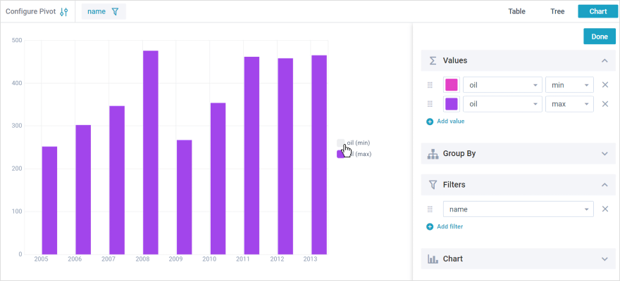
Pivot is the way to present summary reports in the form of a table. It is an irreplaceable tool for creating reports from aggregated data. Pivot allows to work with complex structures of data bases and to create simple clear reports. Pivot tools allow to select necessary data sources and correlate them with different parameters. Also Pivot tools can sort out, sum up and analyze any amounts of information. JS Pivot becomes a powerful analytical tool in the hands of an experienced user. Hexalytics offers a ready-made solution, which is Pivot JavaScript widget. It can be integrated in any business application.
Smooth Integration with Backend Platforms: PHP, Node.js, Golang and .NET.
Meets Section 508 and WAI-ARIA standards and supports keyboard navigation.
Ability to integrate with jQuery, AngularJS, Vue.js, React and third party libraries.
Support of All Modern browsers and Quick CSS Styling of your Hexalytics Pivot Chart.
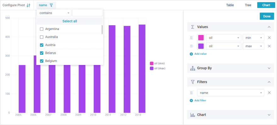
Find and display specific data using various filters.
Show and hide charts in one click.
Change the order of PivotChart rows and columns by dragging configuration window elements, adding custom configurations.
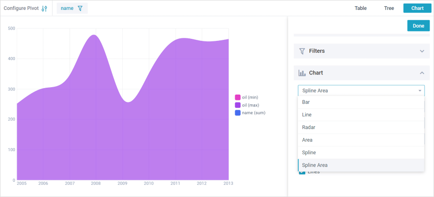
Choose the chart type you like.
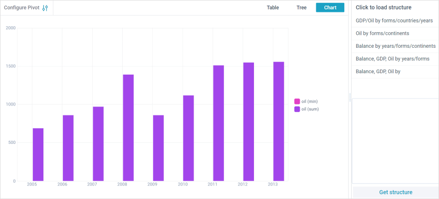
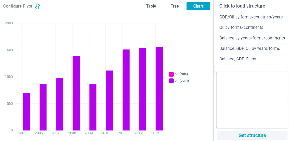
Create and apply structures to instantly change the appearance of charts.